Research Proposal
For this project I will research the racial differences and disparities in American economics, politics, and culture. I will use statistical analysis to look for correlations in these differences. The independent variable will be race and the dependent variables will be family income, political party, and average amount of TV somebody watches.
The GSS Dataset
The dataset is from the General Social Survey (GSS). It is a national survey conducted by NORC at the University of Chicago, to gather data on the complexity of American life. This data is adequate because it collects survey information about peoples preferences and lives. Thiss dataset holds information about a respondent’s age, years of education, race, family income, political party, and number of hours of TV they watch per week.
Loading and Cleaning the Dataset
GSS <- read_excel("~/Dropbox (GPF)/School/Fall 18/Econ 220 Prob & Stats for Economist/Lab/GSS.xls")
GSS$educ <- as.numeric(GSS$educ) #Converting this to a numeric vector
GSS$age <- as.numeric(GSS$age) #Converting this to a numeric vector
GSS$tvhours <- as.numeric(GSS$tvhours) #Converting this to a numeric vector
str(GSS)
## Classes 'tbl_df', 'tbl' and 'data.frame': 2869 obs. of 7 variables:
## $ year : num 2016 2016 2016 2016 2016 ...
## $ age : num 47 61 72 43 55 53 50 23 45 71 ...
## $ educ : num 16 12 16 12 18 14 14 11 12 14 ...
## $ race : chr "White" "White" "White" "White" ...
## $ partyid: chr "Independent" "Ind,near dem" "Not str republican" "Not str republican" ...
## $ tvhours: num 1 1 NA 1 NA 1 2 NA 2 NA ...
## $ coninc : num 163844 39930 59895 163844 163844 ...kable(summary(GSS), digits=2, caption="Social Survey Data") #Using knitr package to create a table| year | age | educ | race | partyid | tvhours | coninc | |
|---|---|---|---|---|---|---|---|
| Min. :2016 | Min. :18.00 | Min. : 0.00 | Length:2869 | Length:2869 | Min. : 0.000 | Min. : 0 | |
| 1st Qu.:2016 | 1st Qu.:34.00 | 1st Qu.:12.00 | Class :character | Class :character | 1st Qu.: 1.000 | 1st Qu.: 13612 | |
| Median :2016 | Median :49.00 | Median :13.00 | Mode :character | Mode :character | Median : 2.000 | Median : 32670 | |
| Mean :2016 | Mean :48.85 | Mean :13.74 | NA | NA | Mean : 3.031 | Mean : 43493 | |
| 3rd Qu.:2016 | 3rd Qu.:62.00 | 3rd Qu.:16.00 | NA | NA | 3rd Qu.: 4.000 | 3rd Qu.: 59895 | |
| Max. :2016 | Max. :88.00 | Max. :20.00 | NA | NA | Max. :24.000 | Max. :163844 | |
| NA’s :2 | NA’s :34 | NA’s :11 | NA | NA | NA’s :986 | NA’s :2 |
Graphs
Graphing Income by Race
GSS <- GSS[ which(!is.na(GSS$race) & !is.na(GSS$coninc)), ] #Removing NA values

ggplot(data =GSS, aes(x=race, y=coninc)) + #Choosing variables race and family income
  geom_boxplot() +
  ggtitle('Race and Income Boxplot') + #Title of the plot
  ylab("Family Income $") + xlab("Race")+ #Labels for the axis
  theme(plot.title = element_text(hjust = 0.5)) #Centering the title
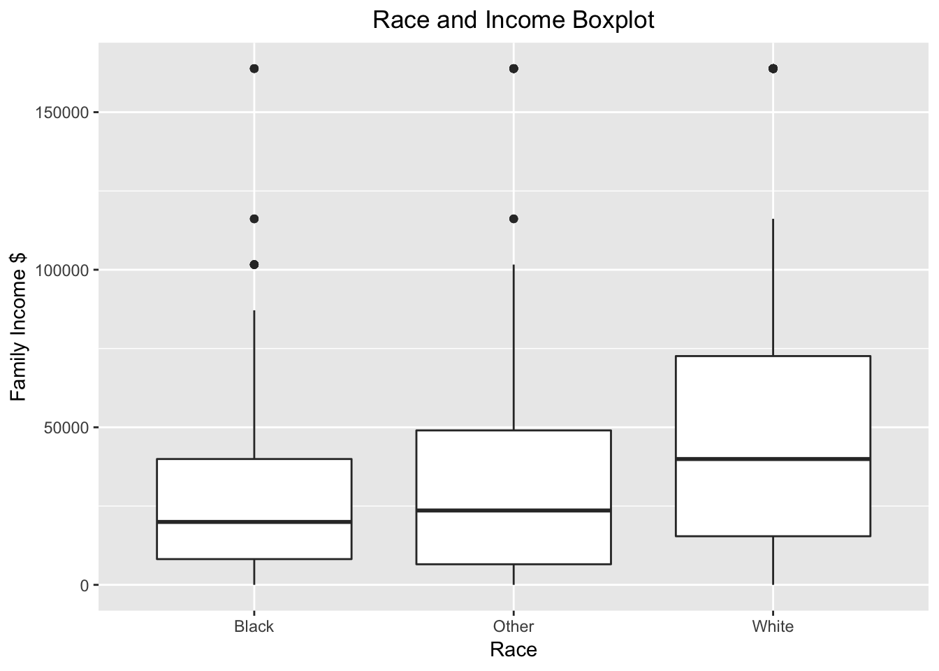
This boxplot displays the distribution of income by race. This has profuond insights, such as the fact that Black people have the lowest mean income, with “other” having the middle average, and White people having the highest income.
Graphing Race, Age, and TV Hours
gss_cat %>%
  group_by(race, age) %>%
  summarise(meantv=mean(tvhours, na.rm = T)) %>%
  #Using dplyr to create a mean TV hours variable and summarise it by race and age
  ggplot(aes(x=age, y=meantv,color=race))+ #GGplot x-axis is age, y-axis is Mean TV Hours, and Color is race
  geom_point() + #Speceifying a scatterplot
  geom_smooth(method = "lm")+ #Affs a trend line on the plot
  ylab("Hours of TV per Week") + xlab("Age")+ #Labels for the axis
  ggtitle("Age, Hours of TV, and Race Scatterplot")+ #Title of the plot
  theme(plot.title = element_text(hjust = 0.5)) #Centering the title
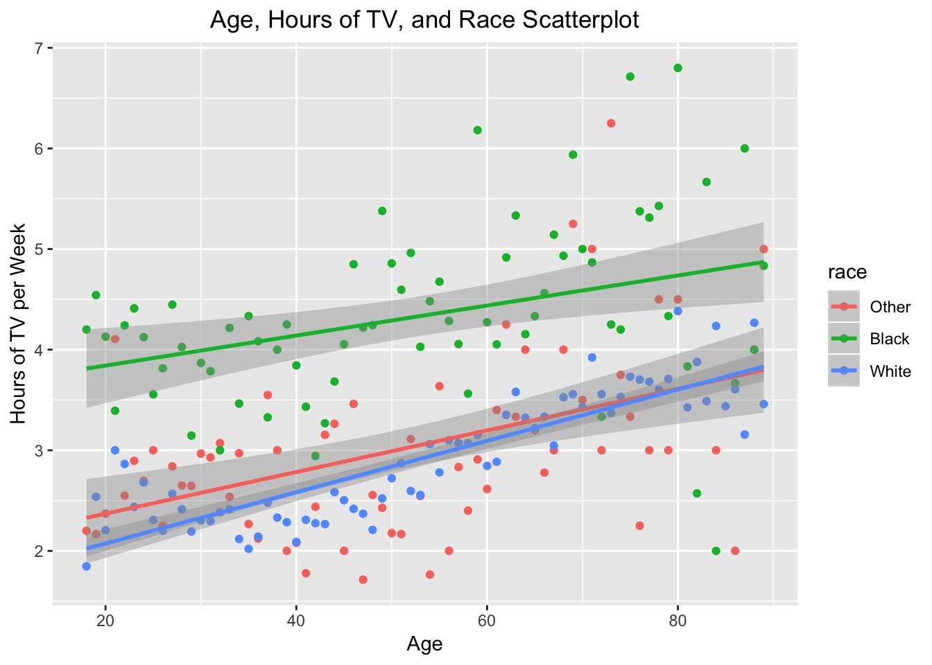
The graph shows that for White, Black, and other races the hours of TV watched per week rises as that population gets older. The three seperate trend lines also reveal racial differences. Whites and others watch similiar amounts of TV especially as they get older, Black people watched signifcantly more TV on average than the other races.
Graphing Race and Political Party
GSS$partyid<-ifelse(GSS$partyid == "Strong republican", "Republican",ifelse(GSS$partyid == "Not str republican", "Republican", ifelse(GSS$partyid == "Ind, near rep", "Republican", ifelse(GSS$partyid == "Ind, near dem", "Democrat", ifelse(GSS$partyid == "Not str democrat", "Democrat",ifelse(GSS$partyid == "Strong Democrat", "Democrat", "Independent" )))))) #Using an ifelse ladder to combine political party identification into Democrat, Repubican, Independent


ggplot(GSS, aes(partyid, fill = race)) + #Selecting political party as variable and race as group value
  theme(axis.text.x = element_text(angle = 45, hjust = 1))+  #This line tilts the axis names so they are readable
  geom_bar(position = "dodge")+ #This splits the bar chart by race instead of stacking the bars
  geom_text(aes(label=..count..),stat="count",position=position_dodge(width=0.9), vjust=-0.25)+ #Adds labels to each bar
   ylab("Count") + xlab("Political Party")+ #Labels for the axis
  ggtitle("Race and Political Party Bar Chart")+ #Title of the plot
  theme(plot.title = element_text(hjust = 0.5)) #Centering the title
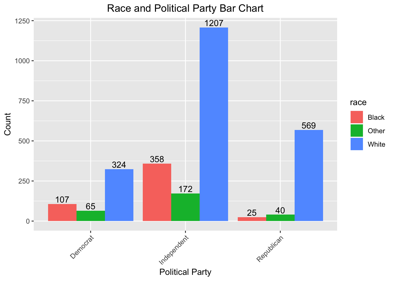
This graph reveals that Democrats are the most racially diverse political group, while Independent is the most popular political category.
Analysis
Income
mean_inc <- aggregate(coninc~race, data=GSS, mean) #Use aggregate function to take mean of family income for each race
print(mean_inc)
## race coninc
## 1 Black 28445.62
## 2 Other 38010.33
## 3 White 47727.90This information shows that the mean income for the White race is 1.7 times more than the mean income for the Black race, clearly there is a racial income disparity in the United States.
TV Hours
One of the most evident correlations was between TV Hours and Age. This relationship can further be explored by running a regression on the two variables.
tvhours_reg<-lm(tvhours~age + coninc, data=GSS) #Running a linear regression on TV hours and Age
print(tvhours_reg) #Pritning results of the regression
##
## Call:
## lm(formula = tvhours ~ age + coninc, data = GSS)
##
## Coefficients:
## (Intercept) age coninc
## 1.647e+00 4.067e-02 -1.371e-05summary(tvhours_reg) #Summarising the regression##
## Call:
## lm(formula = tvhours ~ age + coninc, data = GSS)
##
## Residuals:
## Min 1Q Median 3Q Max
## -4.9414 -1.4945 -0.5185 0.8314 20.3600
##
## Coefficients:
## Estimate Std. Error t value Pr(>|t|)
## (Intercept) 1.647e+00 1.929e-01 8.541 <2e-16 ***
## age 4.067e-02 3.485e-03 11.669 <2e-16 ***
## coninc -1.371e-05 1.480e-06 -9.267 <2e-16 ***
## ---
## Signif. codes: 0 '***' 0.001 '**' 0.01 '*' 0.05 '.' 0.1 ' ' 1
##
## Residual standard error: 2.665 on 1858 degrees of freedom
## (1006 observations deleted due to missingness)
## Multiple R-squared: 0.1079, Adjusted R-squared: 0.1069
## F-statistic: 112.3 on 2 and 1858 DF, p-value: < 2.2e-16mean_tv <- aggregate(tvhours~race, data=GSS, mean) #Use Aggregate to find mean TV Hours per Race
print(mean_tv)## race tvhours
## 1 Black 4.046875
## 2 Other 2.697297
## 3 White 2.840348The regression allows us to see the relationship between age and hours of TV one watches. The regression shows that an increase in age by 1 year results in a 0.04 increase in the hours of TV someone watches. An increase in income by 1,000 is associated with 0.015 decrease in the amount of TV one watches. However; the R-squared value shows that these variables only explain 10% of the data observations. From this data we can also compare the mean hours of TV each race watches.
Inferences
From the social survey data one can analyze racial differences within the United States. A boxplot was used to compare the Family Income averages across races. This revealed that black people have the lowest average wages and speaks to a larger culture of income inequality within the United States. These economic differences effected the racial makeup of America’s political parties. Democrats were the most racially diverse, while Independent was the most popular. After looking at economic and political differences we anlayzed the niche cultural difference of hours of TV watched. Across all races hours of TV increased with age but when split by race it was clear that blakc people watch more TV than the other races. This anlaysis helps understand how one’s race is likely to correlate with economic, political, and cultural differences in the United States.