For this post I decided to walk through the steps of exploratory data analysis using the diamonds dataset that come with base R.
Plotting the Data
data('diamonds') #Loading the dataset

summary(diamonds) #Looking at the summary of the dataset
## carat cut color clarity
## Min. :0.2000 Fair : 1610 D: 6775 SI1 :13065
## 1st Qu.:0.4000 Good : 4906 E: 9797 VS2 :12258
## Median :0.7000 Very Good:12082 F: 9542 SI2 : 9194
## Mean :0.7979 Premium :13791 G:11292 VS1 : 8171
## 3rd Qu.:1.0400 Ideal :21551 H: 8304 VVS2 : 5066
## Max. :5.0100 I: 5422 VVS1 : 3655
## J: 2808 (Other): 2531
## depth table price x
## Min. :43.00 Min. :43.00 Min. : 326 Min. : 0.000
## 1st Qu.:61.00 1st Qu.:56.00 1st Qu.: 950 1st Qu.: 4.710
## Median :61.80 Median :57.00 Median : 2401 Median : 5.700
## Mean :61.75 Mean :57.46 Mean : 3933 Mean : 5.731
## 3rd Qu.:62.50 3rd Qu.:59.00 3rd Qu.: 5324 3rd Qu.: 6.540
## Max. :79.00 Max. :95.00 Max. :18823 Max. :10.740
##
## y z
## Min. : 0.000 Min. : 0.000
## 1st Qu.: 4.720 1st Qu.: 2.910
## Median : 5.710 Median : 3.530
## Mean : 5.735 Mean : 3.539
## 3rd Qu.: 6.540 3rd Qu.: 4.040
## Max. :58.900 Max. :31.800
## From the summary I notice that this dataset features different variables about diamonds. I notice that there is a numeric “price” variable and a categorical “cut”" variable. I wonder if there is a relationship between the price of the diamond and the cut, and if the cut can be used to predict price?
ggplot(diamonds, aes(x=cut, y = price))+
  geom_boxplot()+
  ggtitle("Comparing Diamond Cut and Price")
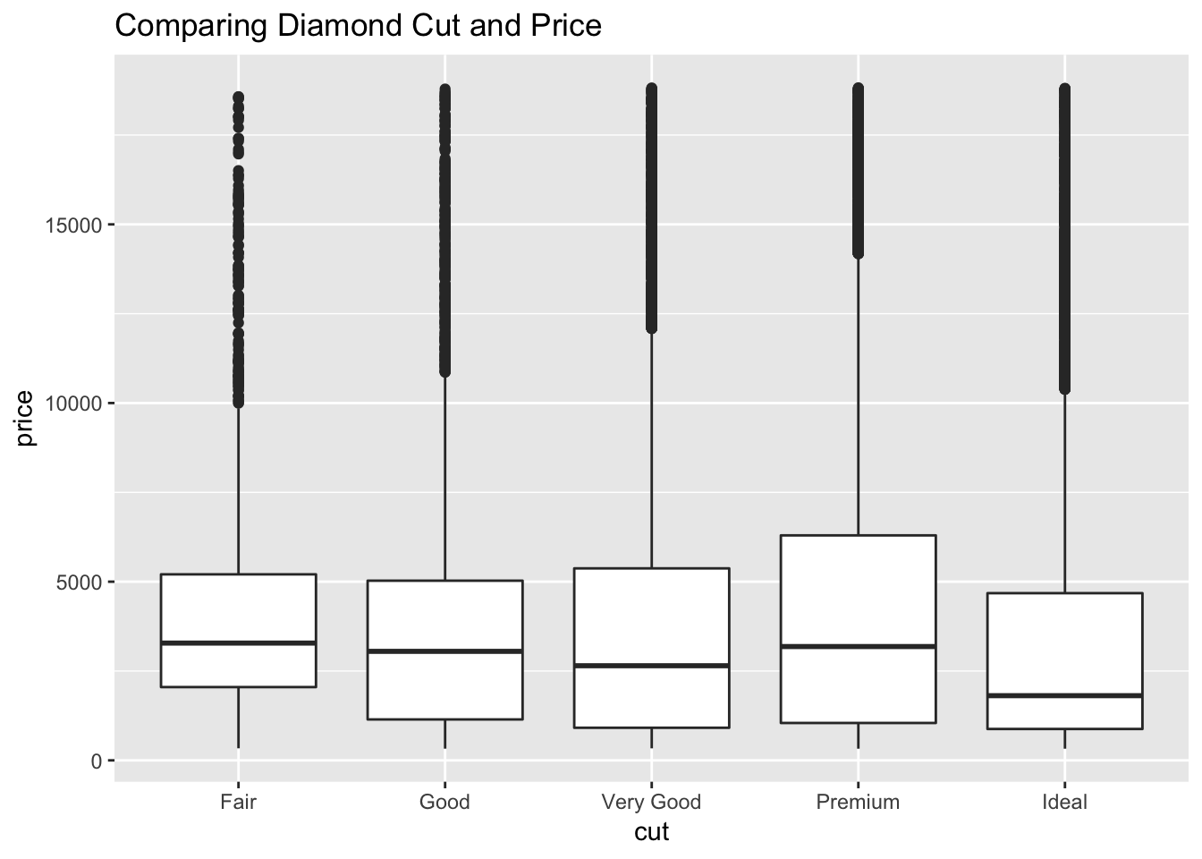
I decided to do a boxplot that measures the price statstics for each cut. The results were unexpected, fair diamonds had the highest average price while ideal had the lowest. There seems to be a lot of outliers in this visualization.
ggplot(diamonds, aes(x=price))+
  geom_histogram()+
  ggtitle("Diamond Price Histogram")
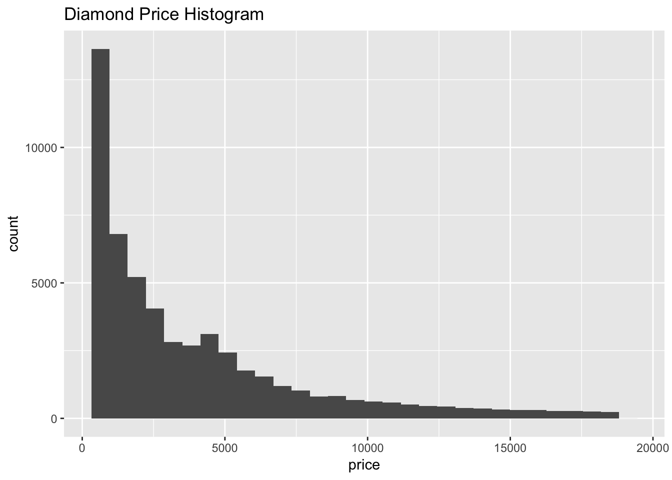
I decided to make a histogram of diamond price to get a better understanding of the first boxplot. This histogram has a strong right skew, meaning that the vast majority of diamonds are sold on the lower end of the price range.
ggplot(data = diamonds, aes(x = price)) +
  geom_histogram() +
  facet_wrap(~ cut)+
  ggtitle("Diamond Price Histograms by Cut")
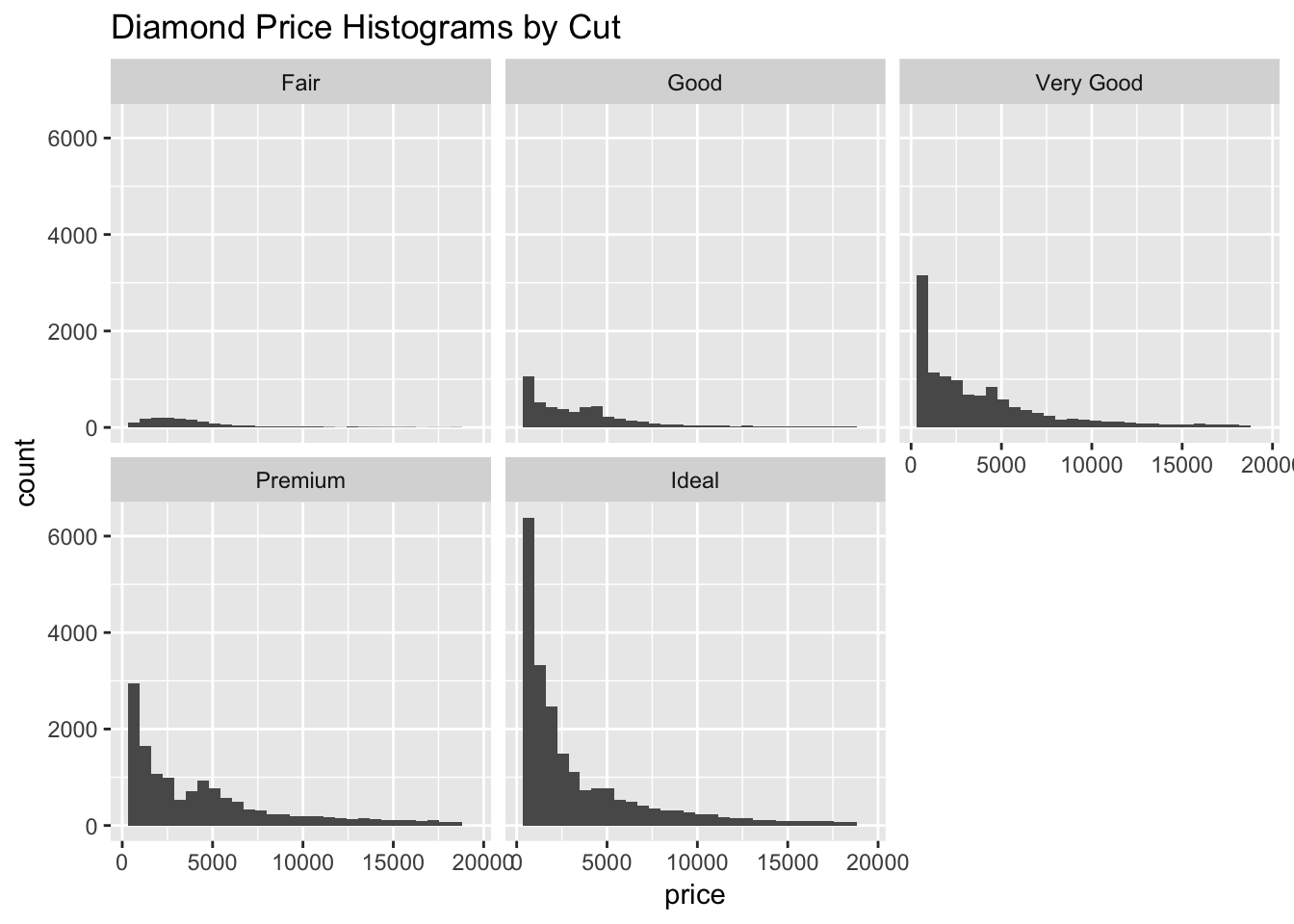
I decided to recreate the same histogram but this time facetting the plot by cut. This histogram helps to explain the unexpected results in the first boxplot. The reason why fair diamonds have the highest average price while ideal diamonds have the lowest has to do with quantity. There are far more ideal diamonds than fair. This also explains the large number of outliers in the boxplot. The cut of the diamond cannot be used to predict price. Perhaps the carat would have a better linear relationship with price? To explore this I will create a scatterplot of the carat and price.
ggplot(diamonds, aes(x= carat,y = price))+
  geom_point()+
  geom_smooth(color= "red", se=FALSE)+
  ggtitle("Diamond Carat and Price Scatter Plot")
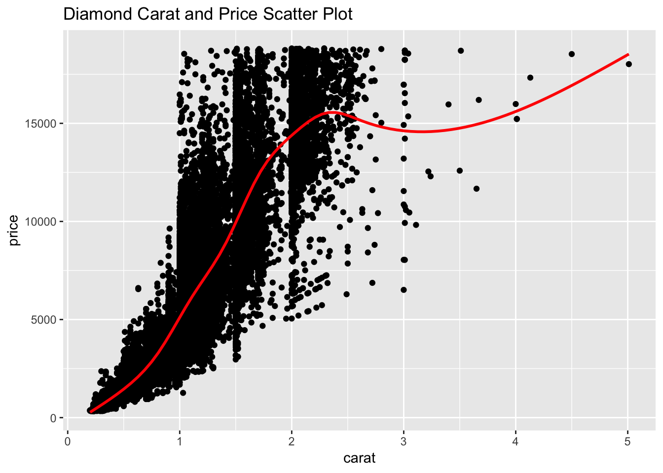
While there are still many outliers there is a stronger linear relationship between carat and price than cut and price.
Results
The diamonds dataset contains information about the price and quality of diamonds. The data shows that the price of diamonds is not correlated with the cut of the diamond. After looking at a histogram it is apparent that this is due to skew in the frequency of the diamonds by cut. There are significantly more Premium and Ideal diamonds than Fair and Good. This is an interesting result that one would not expect. It turns out that the carat of the diamond is a better predictor of price. As the carat goes up so does the price. However; there are not many diamonds that are over three carats in the data. Anyone familiar with diamonds would expect a higher carat to be associated with a higher quality and price, this data supports this expectation.